Table of Contents
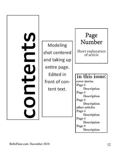
For my table of contents, I chose this layout because I saw it in another style and lifestyle magazine. I thought it looked clean and simple, but the word "contents" being larger and facing vertically intrigued me. I decided that I was going to use one modeling shot to fill up the page similar to the cover page because I liked that style of it. Next, I decided to make the main interview that stood out the most on the cover also the largest part in the table of contents. It will have the page number above it along with the short description. As for the other articles, I plan to include the cover stories once again because they're a focal point of the magazine. The other articles will be a few that I came up with on my flat plan that will be intriguing. The "in the issue" section will be placed over the modeling photo and will add interest to the table of contents as a whole.

Comments
Post a Comment