This is my completed magazine called Belle Fleur. Through the process, I planned, created, and revised my print media until I was satisfied with the results.
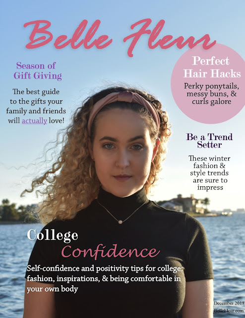 |
| For my cover page, I was mostly content with how it looked after my previous submissions, however I did choose to move the caption "Self-confidence and positivity tips for college: fashion, inspirations, & being comfortable in your own body" slightly to the right so that the white text didn't blend in with the water in the background. I also believe this helps the text stand out more against the black background, making it more eye catching. |
 |
| As for my table of contents, I was happy with the way it looked after my previous submission and didn't make any changes. |
 |
| For my first and second article page, I improved them by justifying my text boxes to make them fit in a more professional looking column format. Additionally, this is the common way text is formatted in magazines, therefore making it important to tweak. Also, for the page numbers, I made sure they were on opposite sides, because when you open a 2 page article spread, the first page will have the page number on the left while the second page would have it on the right. |


Comments
Post a Comment